Time to show the progress on the map layout!
Note: Due to website issues I couldn’t post the updates for day 2 & 3 yet. (I did post them to the World of Level Design forums, FB and partially to twitter though.)
It’s time to make up for that now.
Targeted Gameplay
After the research of Day 1, I had gotten a better feel for what I could reasonably pull of in UE4 given the time constrains and my inexperience in it. With this, I sat down and settled for some more details of the map. I’m aiming for an outdoor 2-6 players team death-match map in UE4 for a first-person shooter with a rifle, rocket and health pickups only. 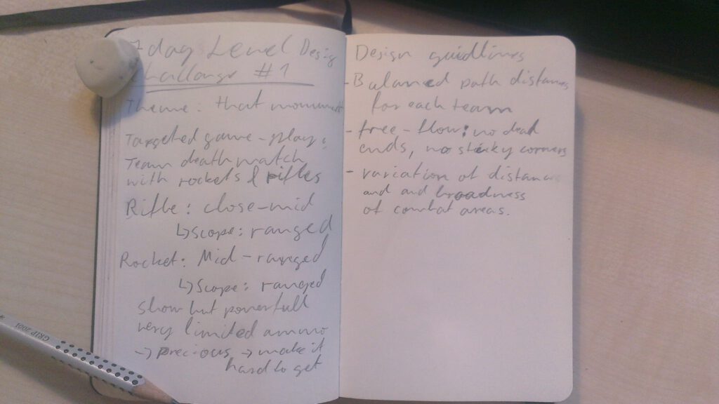
I jotted down some notes and things to consider for the map and moved on to sketching out the map layout.
Bubble Diagrams
I knew that I wanted to offer varying areas of combat to support different playing styles and strategies so I started with these and sketched out some bubble diagrams. Or in other words, I took these areas and mapped them out, with only their rough placement, dimensions and interconnections.
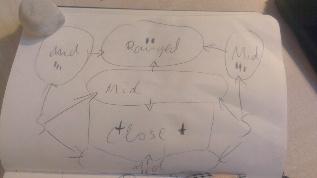
One of the key requirements for death-match maps is to enable a free flow for the player’s movement. No dead ends (or only with a high reward for their risk) and circular pathways. As you can see in the bubble diagram above, there are 4 inner circles encompassed in an outer circle. The arrows only indicate the initial flow away from the spawn-points (“S”).
Map Layout
One of my first layouts based on my preferred bubble diagram had a very strong asymmetry in it. While the playground I found the my landmark on had a similarly asymmetrical layout, I felt like that would compromise the balance far too much.
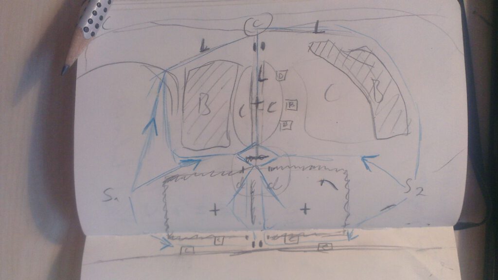
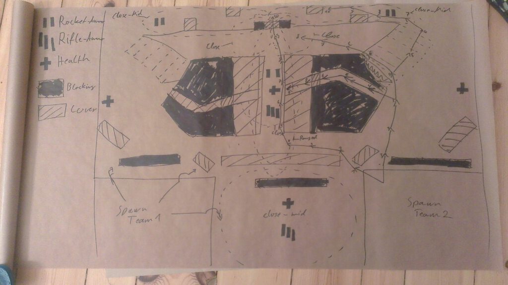
Since it is a team death-match, the easiest way to balance it was through some sort of symmetry. So I wen on and iterated on that until I arrived at this layout:
Going Bigger
My notebook was increasingly getting to small for me so I switched to a roll of brown paper. I like these rolls for brainstorming and layouts, because you can go big on them and expand. Later you can scroll through them and have it in a size where you could easily present them to a group. The only down-side besides requiring more space to work with these is: you can’t just walk around or lie on your back while sketching, as you could with a small sketchbook. 😉
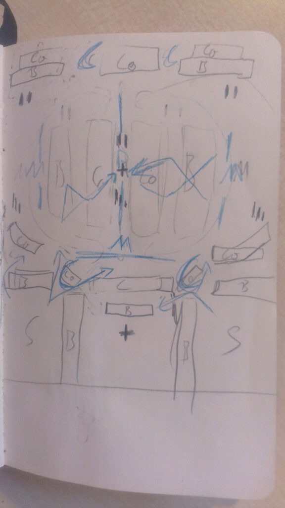
As you can see on the left spawn-point, I already planned in anti-spawn camping mechanisms. The spawn points are elevated and surrounded by a wall that needs to be jumped to enter the combat zone. I used the arrows on the right side, to measure the rough distances to reach different points of interest. Through this I could ensure that they where similar enough to avoid having only one, over powered strategy.
I also tried to balance out risks and rewards. As such, the monument is highly rewarding, but puts the player on a risky, narrow path. Not only can players shot straight through the middle while behind cover, but they could also fall in from the sides. Off course, the paths through the underbrush are also possible escape routes from the monument. They are also a good hiding spot.
Something I only hinted at in the layout before this one, is the alley in the far back. This is both an attack and exit route from the potential sniper-nest behind the two pillars. There are packs of rocket launcher ammunition at their entrances and cover through which one can sneak up on potential campers.
BSP Grey-box modelling
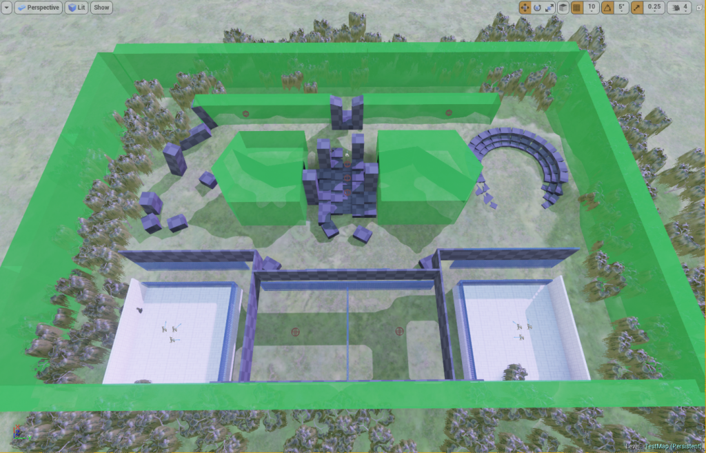
Being rather happy with that layout I jumped into the editor and started modelling the grey-box version in BSP.
E.g. in the case of this map, the two transparent shapes left and right of the center occupy space. Inside of each of them are two angled boxes which free space by subtracting it from the green ones.
The transparent green areas are map boundaries that will be represented through a thick forest. There is some remaining asymmetry in the map to keep it visually interesting and offer slight variations for navigating it. To ensure the balance i took measures of the time it took me too reach different locations and adjusted accordingly.
I also modeled what should become some sort of a fence that aims to prevent sniping to and from the spawn-point areas. At this point, adding more BSP brushes to the scene or modifying existing ones seemed like a sure-fire way to kill the Engine, if the lag in the update and the undo behavior is any good indication for that. (EDIT: Apparently it only needed a restart)

Leave a Comment